Trivvr
How might live trivia events be easier for hosts to manage, and more enjoyable for participants to play?
Role
UX Designer
Research, ideation, UX design, UI design, testing
Date
2021
Why This Project?
I can barely remember what I did last week, but I can rattle off most of the world’s capitals at the drop of a hat. Maybe that’s why I love trivia so much. I play at a neighborhood bar with friends most Mondays, and host trivia with my own questions every few months.
Hosting, while fun, is a hassle. Players have to wait in between rounds while the host collects sheets, grades answers, and enters scores into a spreadsheet. I found myself pondering a more efficient way to host, and by extension, a more enjoyable way to play.
I decided to explore whether an app could help facilitate live trivia. I tested out existing options (spoiler alert: they’re all various shades of bad). I interviewed trivia players, hosts, and business owners. Eventually, I ended up with Trivvr, named after the host of my neighborhood bar trivia: the man, the myth, the Trevor.
Research
The Competition
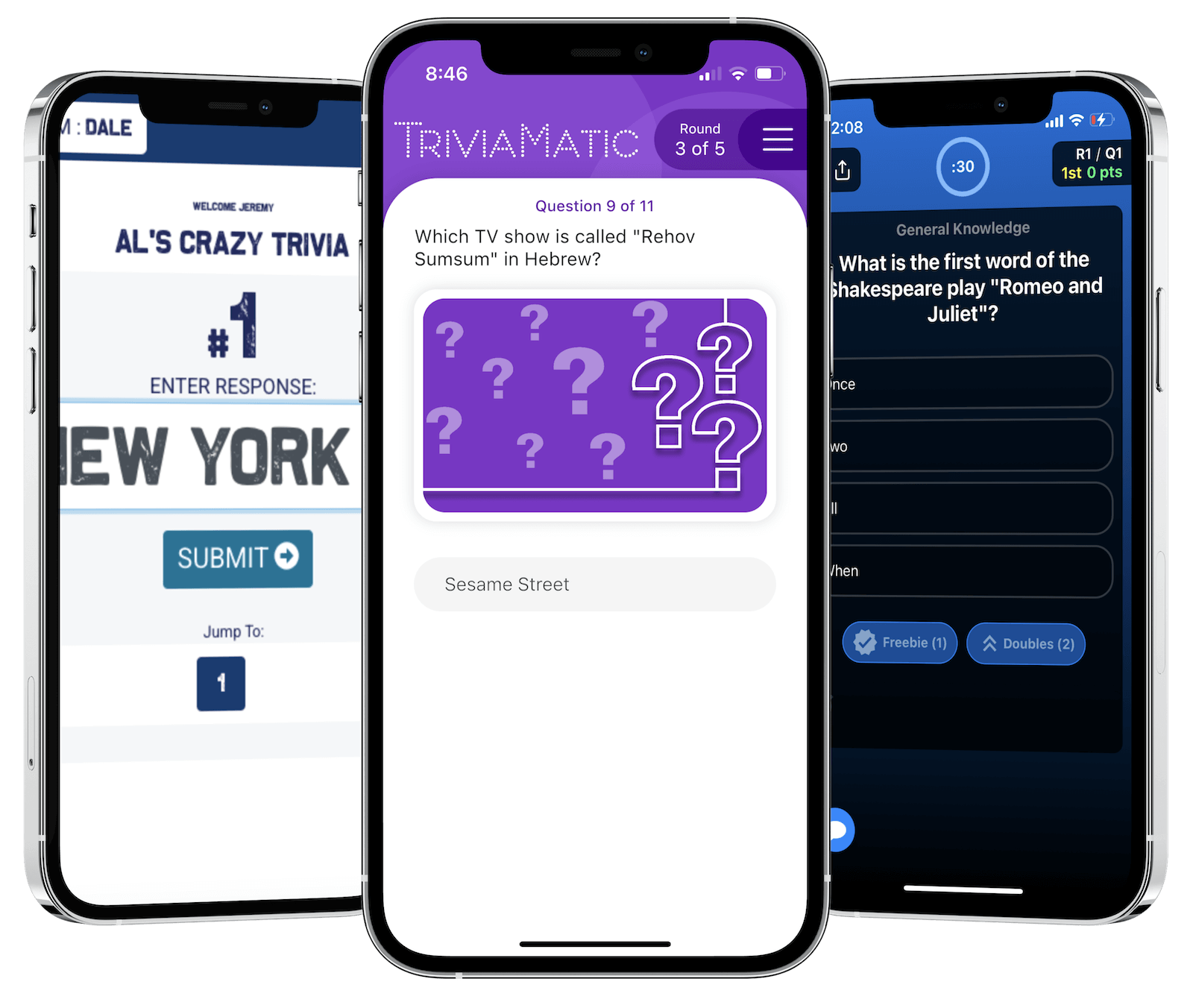
I tested TriviaMatic, TrivNow, and TriviaRat by myself both as a host and as a player. I also found a local trivia event that uses TriviaMatic, and participated in live app-assisted trivia there.
Each app does some things well and some things poorly. TriviaMatic worked mostly okay from a technical standpoint. It delivered questions to teams. It graded answers. It also lagged out a few times and I had to close and reopen the app. However, it just made trivia less fun. People were having difficulty finding where things were located in the app like the scores. Font sizes are small and icons aren't labeled. Overall, it was a mostly function yet rather joyless experience.
The other two apps, TrivNow and TriviaRat had even worse UI design and seemed far less customizable. I wasn't impressed with any existing option.
Interviews
I interviewed two hosts, two regular players, and the owner of a trivia company. I also surveyed around twenty hosts and players. My goal was to gain insight into why hosts enjoy hosting trivia, why players enjoy playing trivia, and how an app could make the experience even better for both sets of people.
Research Takeaways
- A few people were worried that an app encourage cheating, as players could be more likely to use the phone to look up answers. However, most people didn't consider this an important factor.
- Cheating aside, every host either uses an app or was open to trying one. Hosts were especially excited about the possibility of automated grading and question organization. They reported spending a lot of time with housekeeping that an app could automate, which would leave them more time to engage with the players, get a fresh beer, or just have the entire event go more quickly.
- Players were more tentative about an app, but only the few who were worried about cheating were outright against it. The rest were mostly apprehensive about the app taking away from the overall experience. This was especially true of players who used TriviaMatic to play. They reported that the event didn't use an app until a few months ago, and that it used to be a more enjoyable experience with paper and pencil. The reasons for this were mostly centered around the old way feeling more personable, though one person mentioned missing the ability to take notes underneath a question they weren't certain about.
Definition
Utilizing research findings
Interviews and surveys painted a fuzzy picture that gave me enough to proceed. Some people were worried about digitizing live trivia - concerns included players being more likely to cheat, or to just be staring at their phone the whole time.
However, most players and hosts were excited about the possibilities that an app afforded. Instant and accurate grading was hugely enticing to hosts. Eco-conscious participants liked the idea of cutting down on paper. And the prospect of an app tracking and ranking teams across different locations meant the possibility for inter-location tournaments.
User Flow
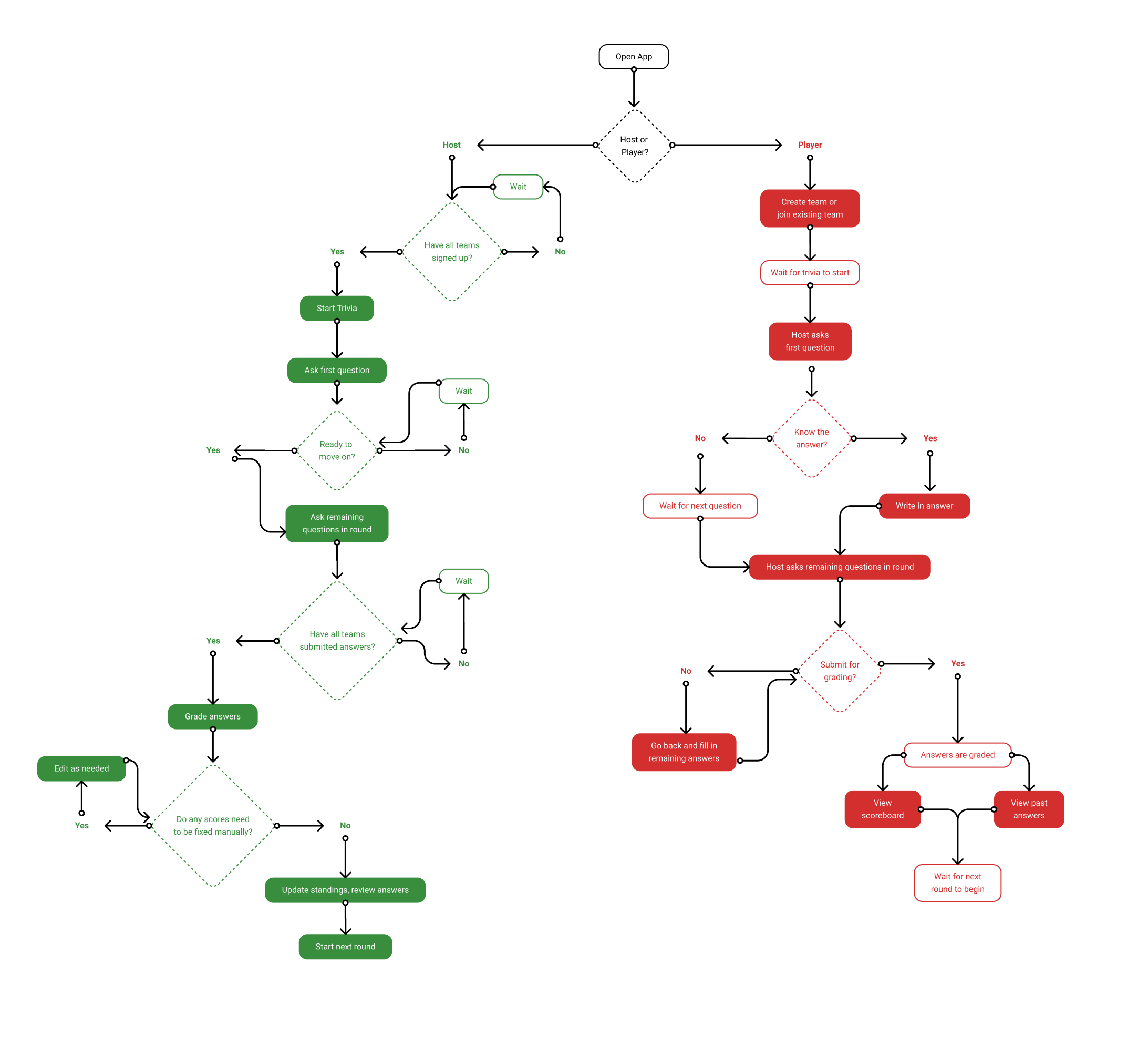
I focused on the single most important feature of the app – gameplay. There are two main users: players and hosts. Players join the room in the app, answer the questions, and check how they did. Hosts ask the questions, collect responses, and confirm that the app graded the answers correctly.
Ideation
Wireframes
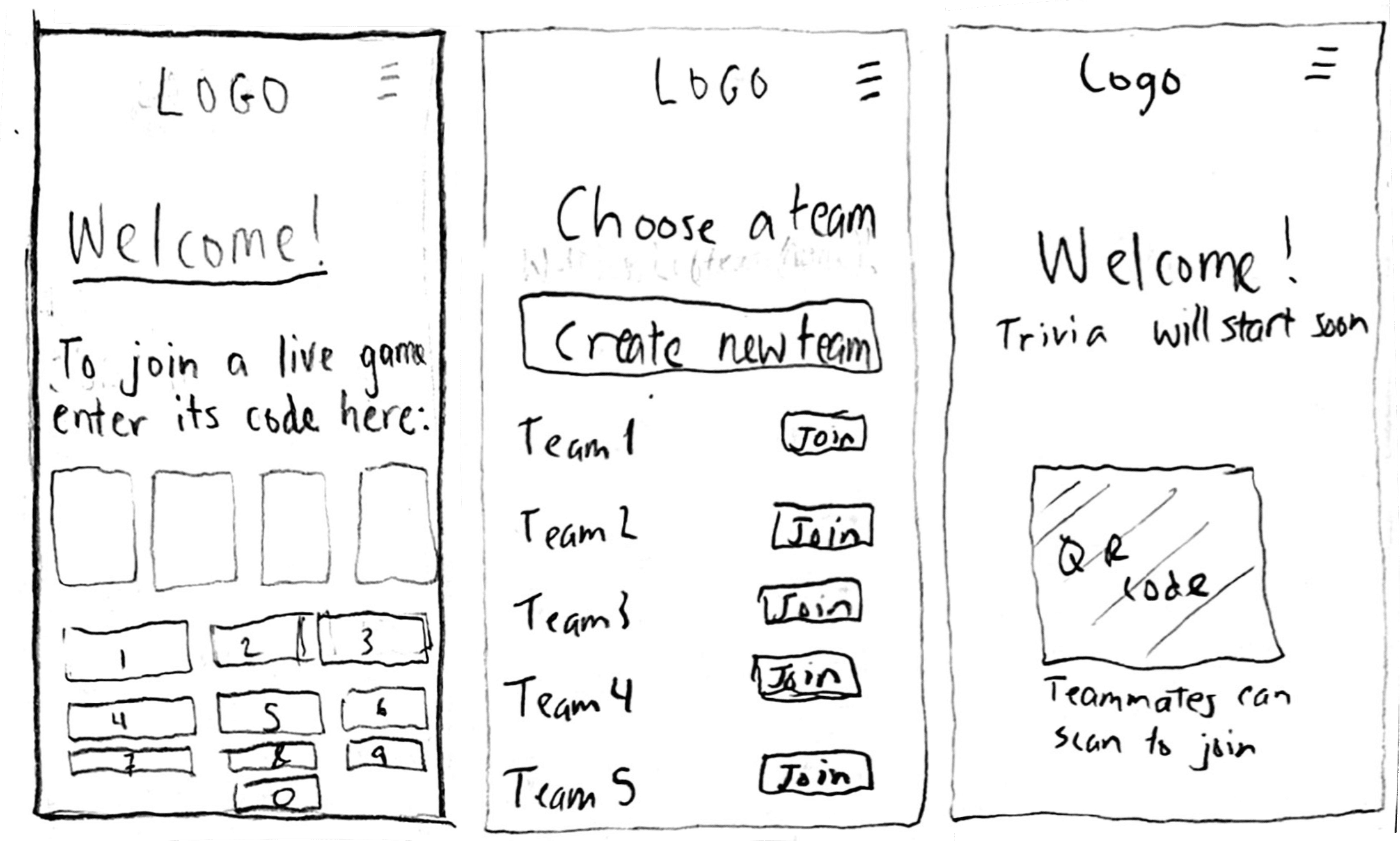
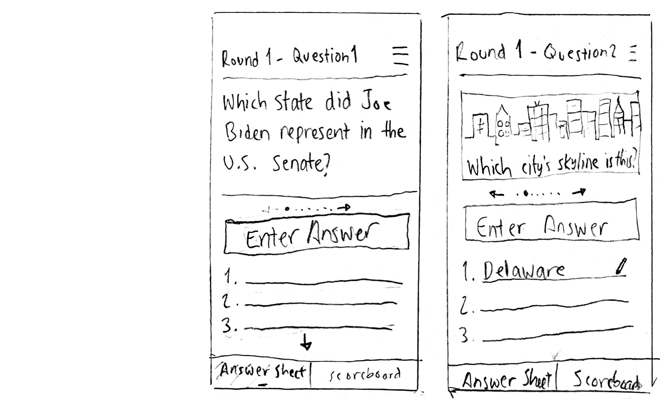
Based on feedback, it was extremely important to make the app feel intuitive, unobtrusive, and as experientially similar to paper and pencil as possible. Trivia is meant to be a fun activity, and people will have little tolerance for an app that gets in the way of their enjoyment. Furthermore, because of the nature of bar trivia, players may not be entirely sober - further highlighting the need for an easy to use app!
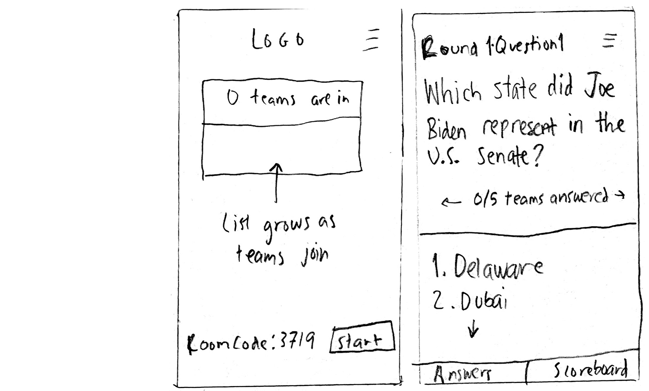
I began sketching out frames that aligned with the user flow, then refined them in Figma so I could test my design. To view the full set of mid-fi wireframes, click the button below.

Design
You can try out the prototype for yourself now, or read on for a breakdown of my design process. Note that viewing Figma prototypes on a phone is a little bit funky. I'd recommend using a computer or tablet.
Color
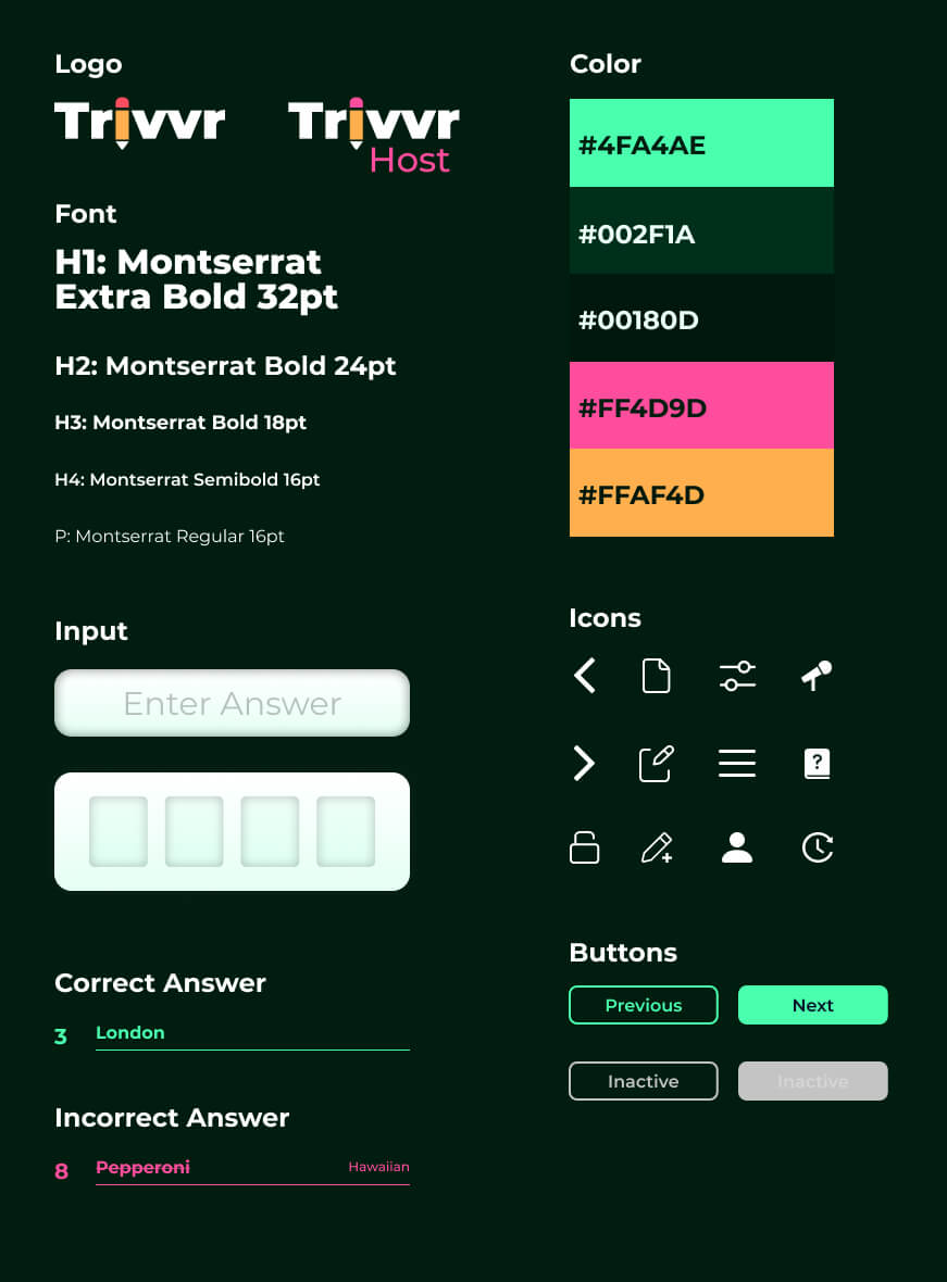
My first, and arguably easiest design decision was to use a dark color scheme, except for where answers are recorded. Bar trivia tends to be dimly lit, and bright phones can be distracting.
On the flip side, research led me to the conclusion that it was important to have the place where answers are recorded mimic paper, which is white. Ultimately I split the difference. The answer sheet is white and the rest of the page is dark, with one vibrant green accent color for aesthetics.
UI
During the interviews, practically everyone agreed on one thing: they want an app that players need to use as little as possible. The less the app is used, the more the players can focus on the live trivia experience. As such, I designed the interface to be as uncluttered as possible, with only the essential features easily accessible:
- The current question
- An entry field to answer the question
- A list of previous questions (so they can be edited before turning in the round's answers
- A two item menu at the bottom that toggles between the answer sheet and the scoreboard
Interactive Component Library
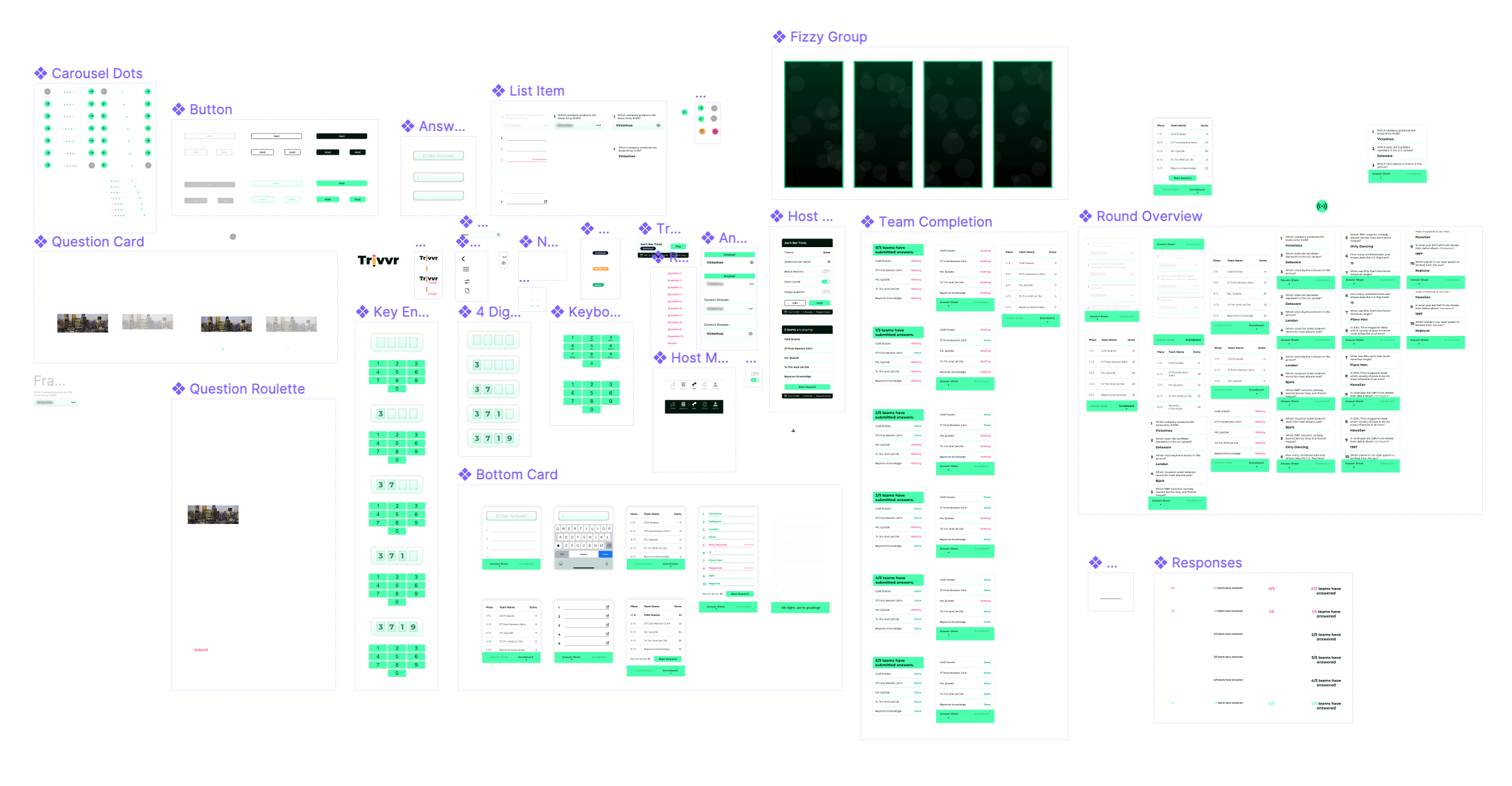
Creating a realistic prototype required either a massive number of screens or efficient use of components. I chose the latter. By creating a robust library of interactive components, I was able to add animations that made the prototype more immersive and authentic. The video clips below demonstrate some of these animations.
Gameplay
Joining A Game
Nobody likes signing up for things, especially at a bar. It's important that players can enjoy trivia without having to register. All they'd need to do is open the app and punch in a four digit code that the host will provide. Then they can create a team or join an existing team.
After the event is over (or during a break between rounds), teams have the option to register so that their results can be saved and tracked over time.
Answering Questions
Different trivia events have different rules, and hosts can customize Trivvr to suit their needs. For this example, a round has ten questions, and teams submit their answers once at the end of the round rather than submitting after each question. Players can see the answer sheet in the bottom half, to mimic the experience of having the sheet on hand.
Submitting Answers
At the end of the round, teams can review any answers they're uncertain of, then submit their sheets for grading. The host checks for any typos that the app marked wrong incorrectly, and then teams can see how they did!
Hosting overview
The home screen has a button that takes you to the hosting portal. If you're not registered, you would need to sign up/sign in at this point, since hosts need data stored (saved questions, connection to other hosts, etc)
Once logged in, hosts can launch a trivia match they made (or one they have access to), create their own, or just add some questions to the question bank for later use.
To start a match, hosts just select the appropriate trivia, adjust the settings, and wait for teams to sign in. Looks like five teams are playing tonight!
Host interface
During gameplay, hosts' screens look similar to players. However hosts can see all of the ronud's questions and answers ahead of time. When the host hits 'next' or 'previous', it takes all of the players to the next screen.
After reading the final question for the round, the host can give teams time to finish writing down any missing answers and wait for teams to submit their answers for grading.
Grading Answers
Once the host clicks 'Lock Answers', teams can no longer make edits and are graded on whatever they've filled in.
The app grades answers, and the host can make any manual adjustments necessary. Traditionally, the host would go over the round with the players at this time.
To start a match, hosts just select the appropriate trivia, adjust the settings, and wait for teams to sign in. Looks like five teams are playing tonight!
Validation
Usability Tests
I combined the two functions (hosting and playing) into one prototype and had users run through it and provide detailed feedback.
Players and hosts who have used an app before were extremely encouraged by Trivrr's design, and found it much more enjoyable than existing apps. Those who hadn't used an app before had little spots of trouble throughout the prototype, but figured it out eventually. Some of these issues were due to Figma's prototyping limitations, like how you can't really store keyboard input.
Because the rules of trivia vary so much from location to location, some users were confused why there were or or weren't certain rules in place (like a time limit). Others couldn't tell whether or not their answers were locked once they typed it in. Because Trivvr is meant to be used in conjunction with a live host and isn't a standalone platform, it would be the role of the host to explain the rules at the start of the event.
Some users simply didn't care how good the app was – they didn't want to use a phone while playing trivia. This is totally understandable – I even agree to an extent! After getting this response from a couple people during my research, I realized that the goal of Trivvr isn't to replace old school paper and pencil, it's to be the best digital alternative available.
Next Steps
- I didn't include many of the requested features in my MVP prototype. Some of the host screens have a global nav menu that alludes to a question bank and a trivia creator. This would be the next priority, as hosts can't do their job without questions to gather and compaile into rounds.
- There were other host requests that would be very worth testing, like in-app tipping via Venmo/Cash App integration. A tip jar doesn't work if people don't carry cash!
- I personally don't think it's a big issue, but enough people mentioned concern about cheating that I'll ignore my biases and explore adding an option to penalize leaving the app (so people can't look up the answer).
- Both players and hosts want to be able to save teams' results over the long term. This both creates a long term competitive atmosphere, and allows for things like tournaments to take place periodically, where only the top teams compete.
- Last but not least (but last because it's the lowest priority), I had one person suggest gameifying the app in a similar manner to FourSquare where teams earn badges for things like multiple correct answers in a row, attending five events in a month, and so forth. I loved the idea and would be very curious to see how it tested, but I certainly prioritize it below virtually everything else.
