Franz Bakery
How might a bakery's web presence better suit the needs of its core users?
Role
Principal Designer
UX Design, UI Design, Web Design, Prototyping & Testing, User Research
Date
2018-2019
Stakeholder Requirements
The stakeholders were a core group of Franz executives - most notably the VP of Marketing. During our kickoff meeting, the following issues were identified, and flipped into questions that would guide my research:
- Customers and employees using the site found it difficult to navigate and locate products. How can the information architecture be improved?
- Product nutritional information was poorly laid out. Is there a way to address this?
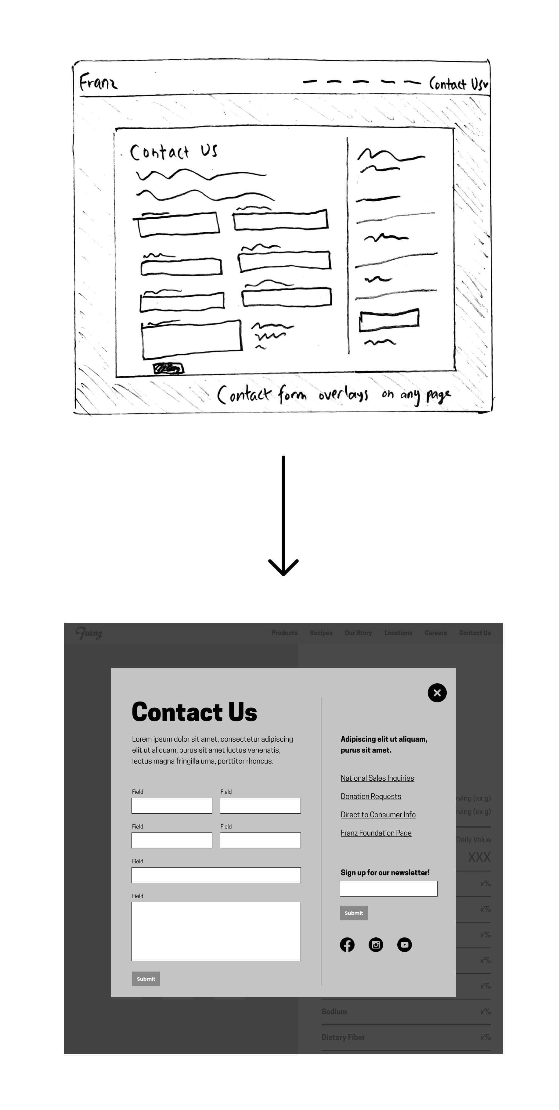
- Many customers and clients were reaching out to the wrong departments. How can this communication inefficiency be improved?
- The site loaded extremely slowly. Can it be snappier?
Research
Employee Interviews
I spoke to a wide range of employees to learn how they used the company website.
- Salespeople used the site on their phone or tablet, or printed pages from the site ahead of time, when pitching products to vendors. They consistently found it difficult to navigate to a specific product, and wished it didn't take so long for pages to load.
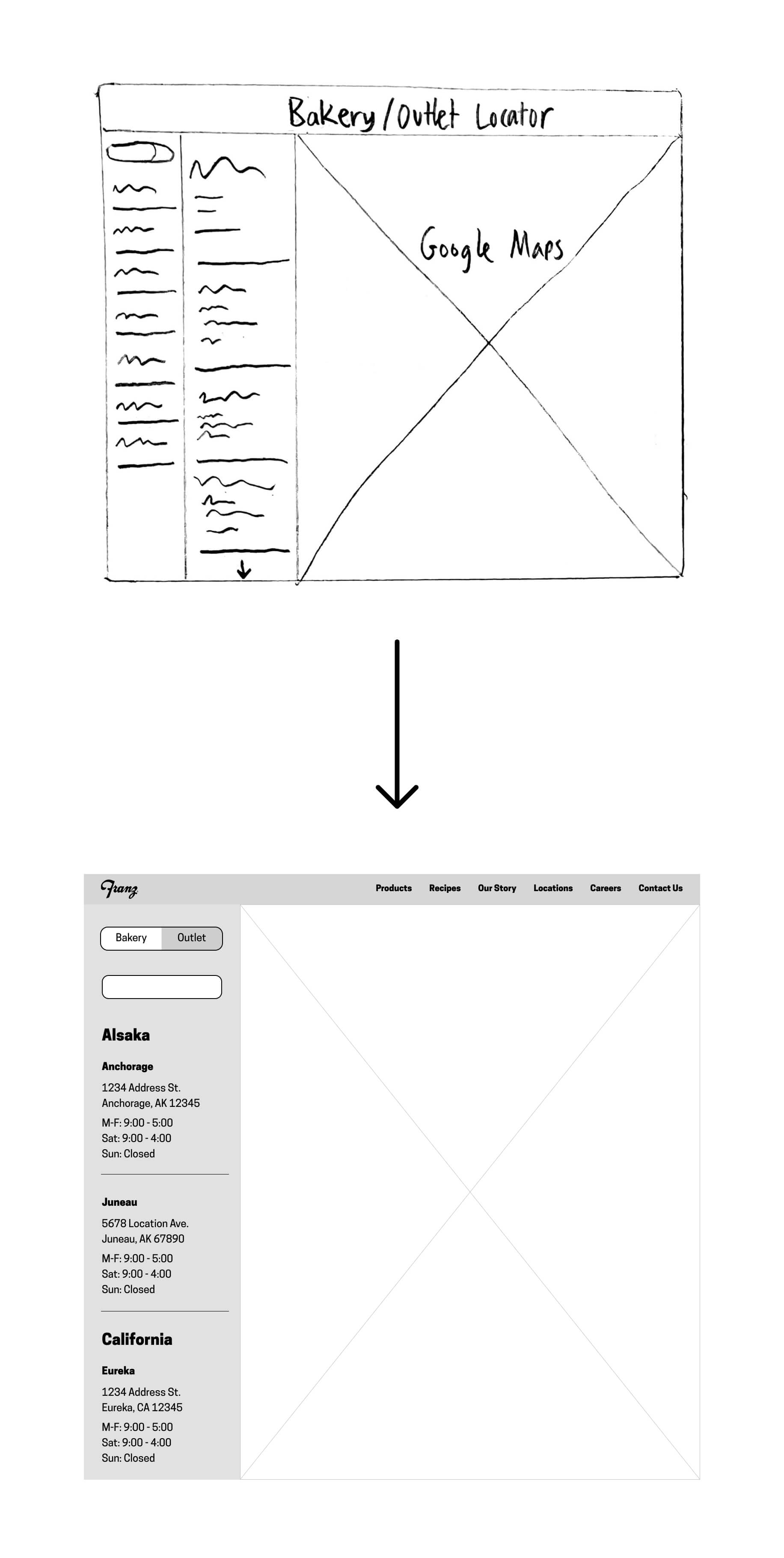
- Retail Managers relied on accurate store information to bring customers in. Franz has over a hundred outlet stores, and the retail team wanted a map on the site to help drive foot traffic.
- Customer Support staff received mountains of feedback, questions, and complaints every day. Much of what they received wasn't relevant to their department, or could have easily been answered elsewhere on the site.
Customers
- Health-conscious customers, or those with specific dietary needs, relied on the site for up-to-date dietary information for products. Some found it difficult to locate products in question.
- Some users with questions not answered on the site were unsure who specifically to contact. They would inevitably fill out a generic catch-all contact form, which often led to delays in getting their inquiries attended to.
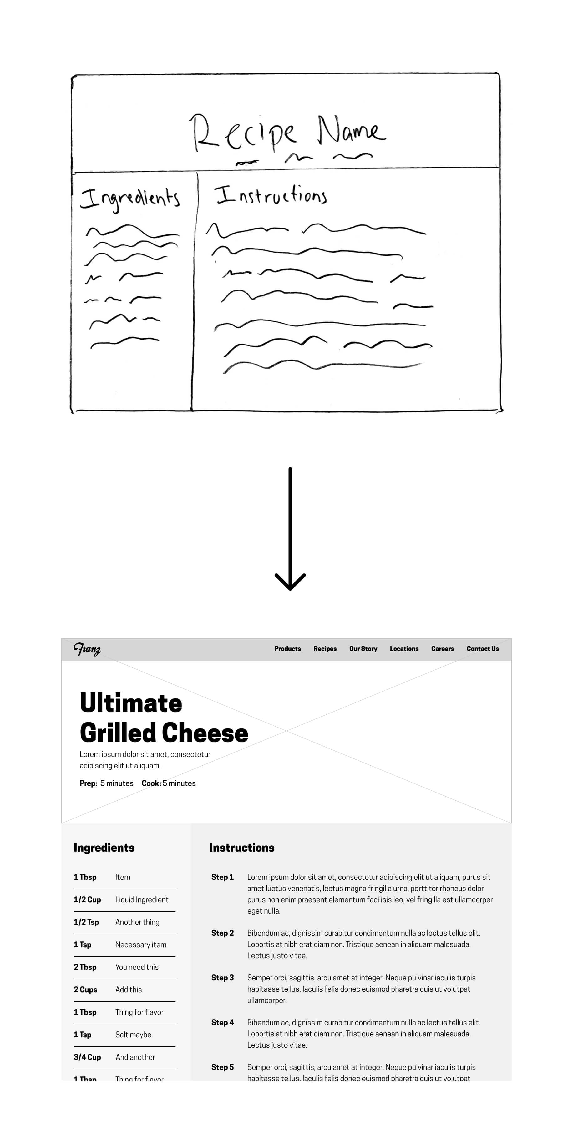
- Some customers requested a larger and easier to read recipes page.
Research Takeaways
- Employees and customers alike found it difficult to sort through the products on the old site.
- Users wishing to reach out to a specific department often couldn't find the correct point person, and just submitted a generic support form. This was frustrating for the customer support personnel, and ultimately made it take longer for the submitter to get a response.
- Everyone was annoyed by the load times on the old site.
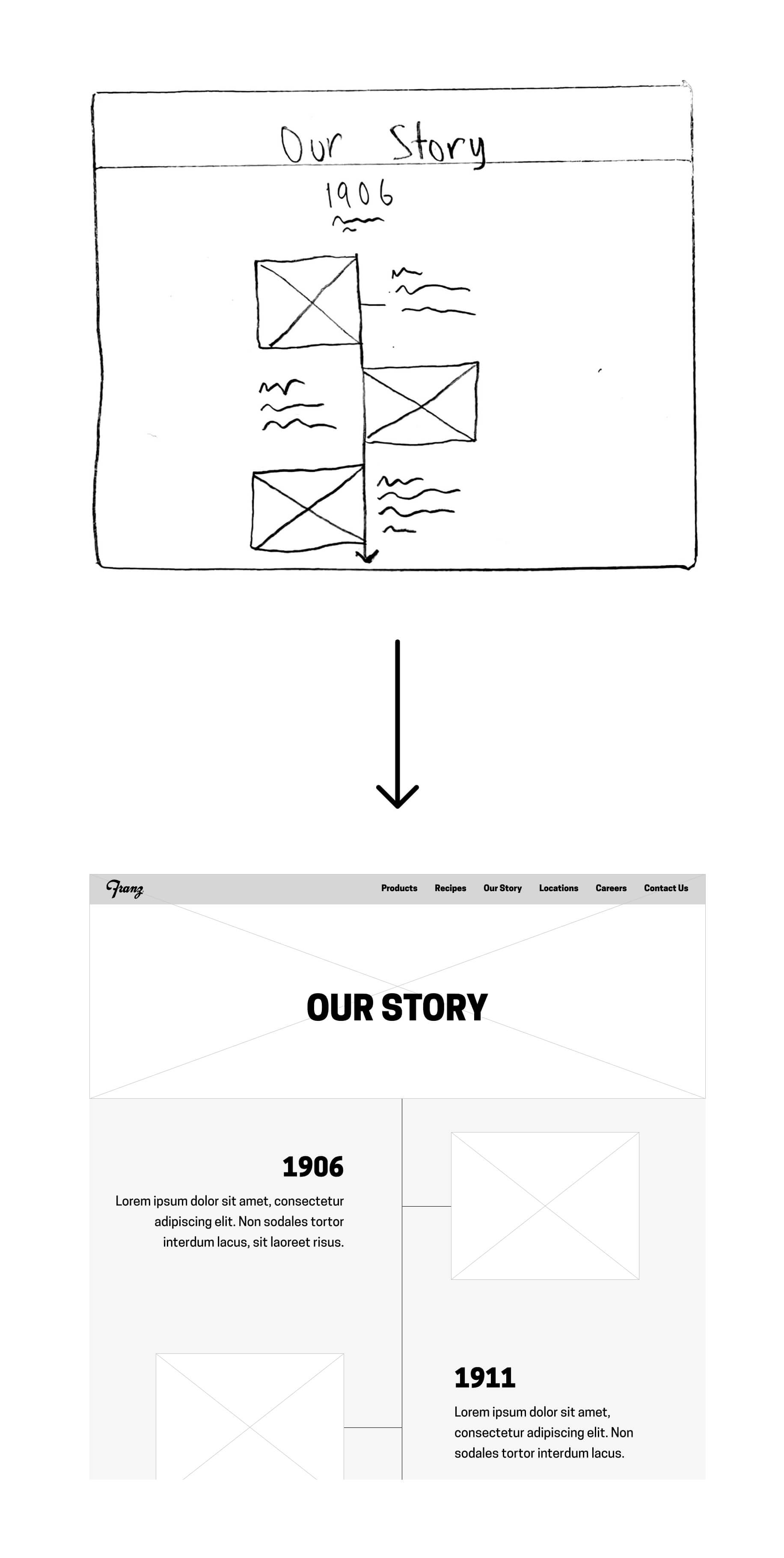
- Franz is a famiy-owned business. Many executives are related to the eponymous Englebert Franz, who founded the company in 1906. It was clearly very important to tell the story of Franz and create an emotion connection between the brand and the consumer.
Definition
Utilizing research findings
My findings fell into three buckets: non-negotiable requirements set by stakeholders, user needs discovered during interviews, and promising features I found when conducting secondary research. I took every feature from these buckets and organized them by priority level.
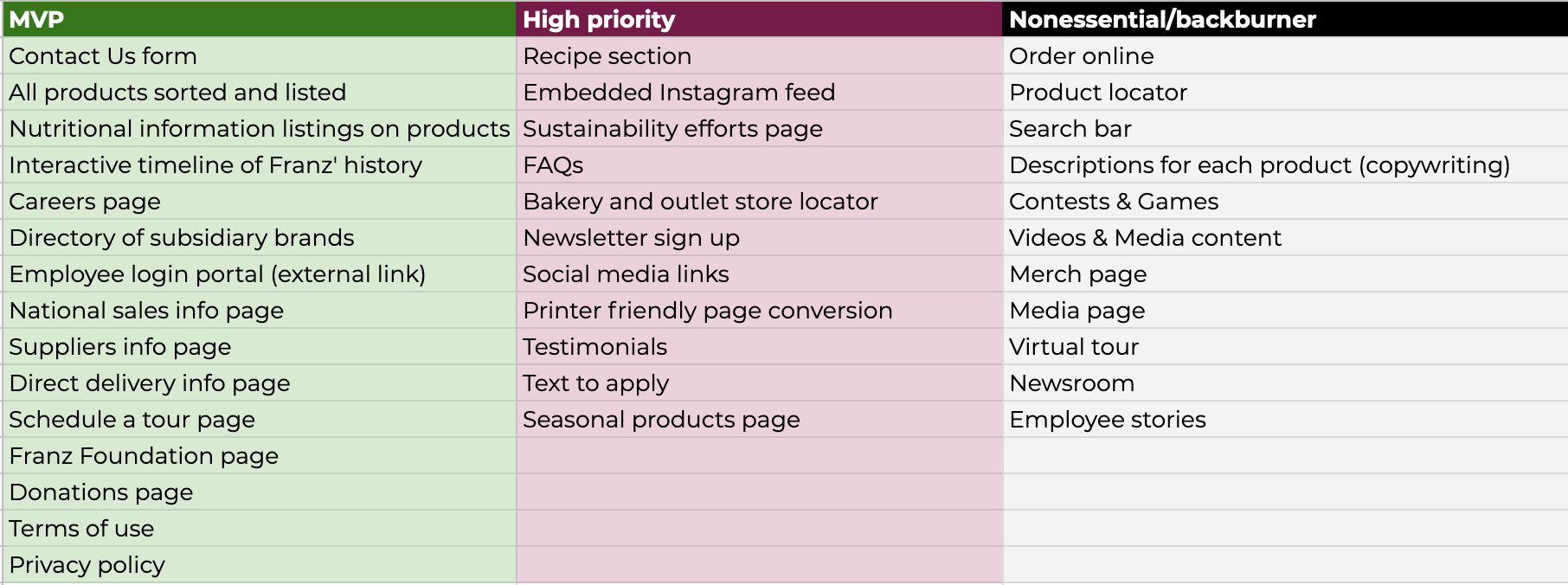
Product Sorting
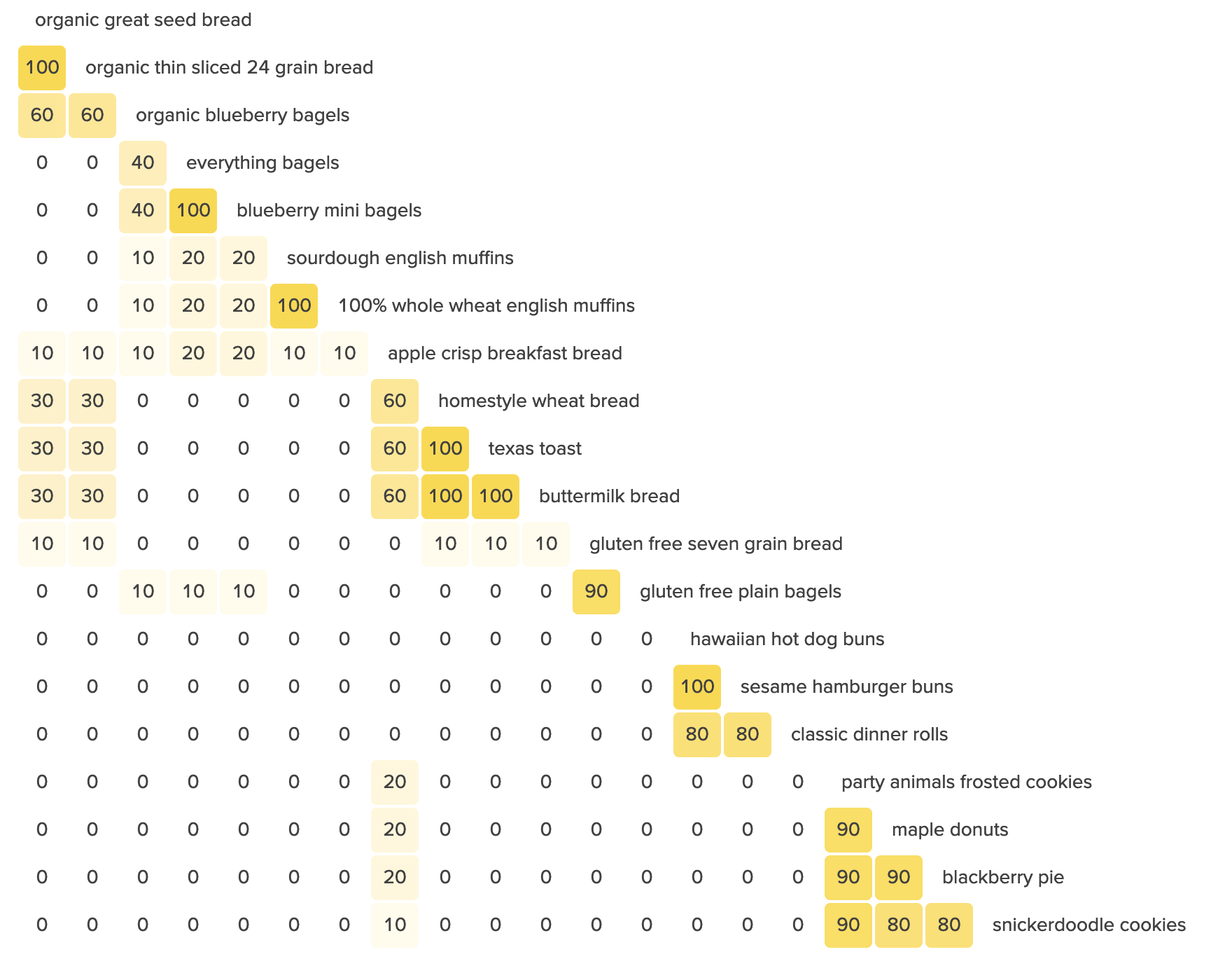
One of the more unexpectedly interesting parts of this project was figuring out how to categorize Franz’ products! With over 100 different breads, bagels, English muffins, cookies, donuts, and so on, there was no obvious way to sort everything. Do bagels and English muffins fall under a ‘Breakfast’ category? Do organic products fall under their own section, or get dispersed into their appropriate categories?
It wasn’t up to me – I had ten customers and employees participate in a card sorting exercise, and used the data to inform any decisions.
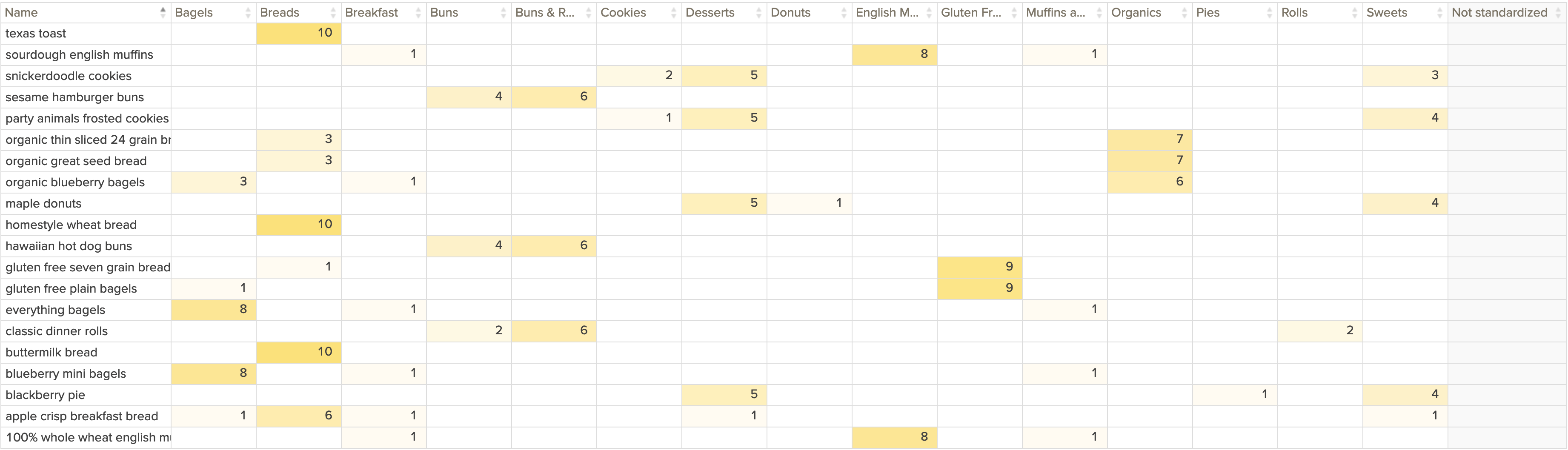
Sorting Results
- There was broad agreement on many categories, such as Bagels, English Muffins, Gluten Free, and Breads.
- There was also a majority who placed cookies, pies, and donuts in the same category – half called this category 'Sweets', and half called it 'Desserts'.
- Participants were split on whether to create a dedicated Organics category or to disperse the items into other categories. I learned that the company is trying to establish a foothold in the organic breads sector, and thus chose to create a dedicated category for it.
- The only real split was whether or not to combine Buns and Rolls. I chose to combine them, as they share similar uses.
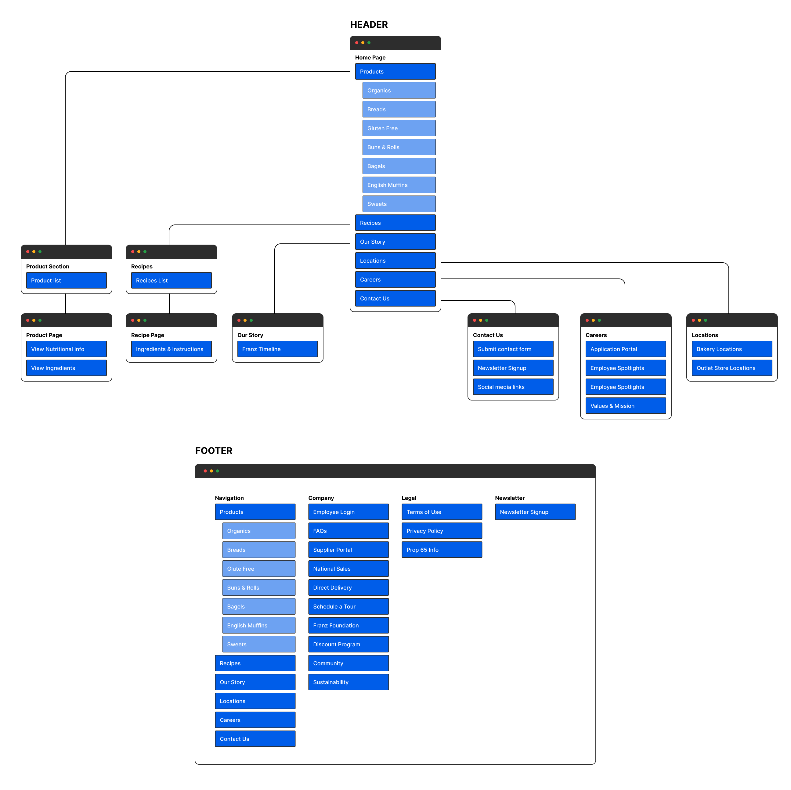
Site Map
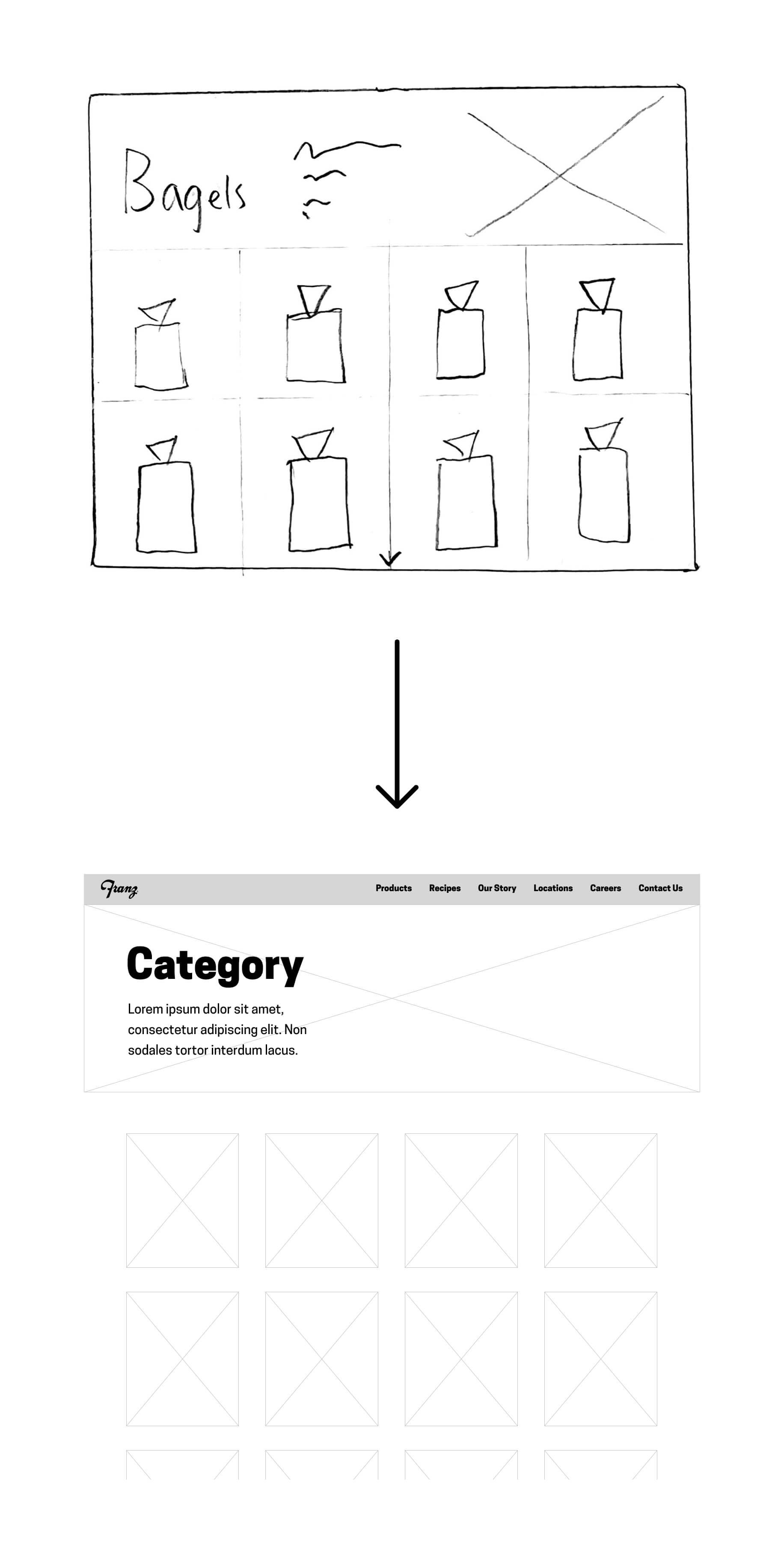
The main menu would contain links for Products (which would open a dropdown menu containing product categories), Recipes, Story, Locations, and Contact Us. These were expected to be the highest traffic pages, though Analytics would eventually put this to the test.
The footer links to a number of small pages that are only relevant to a specific people. For example, the product donation request page, or the Franz Foundation page.
Ideation
Wireframes
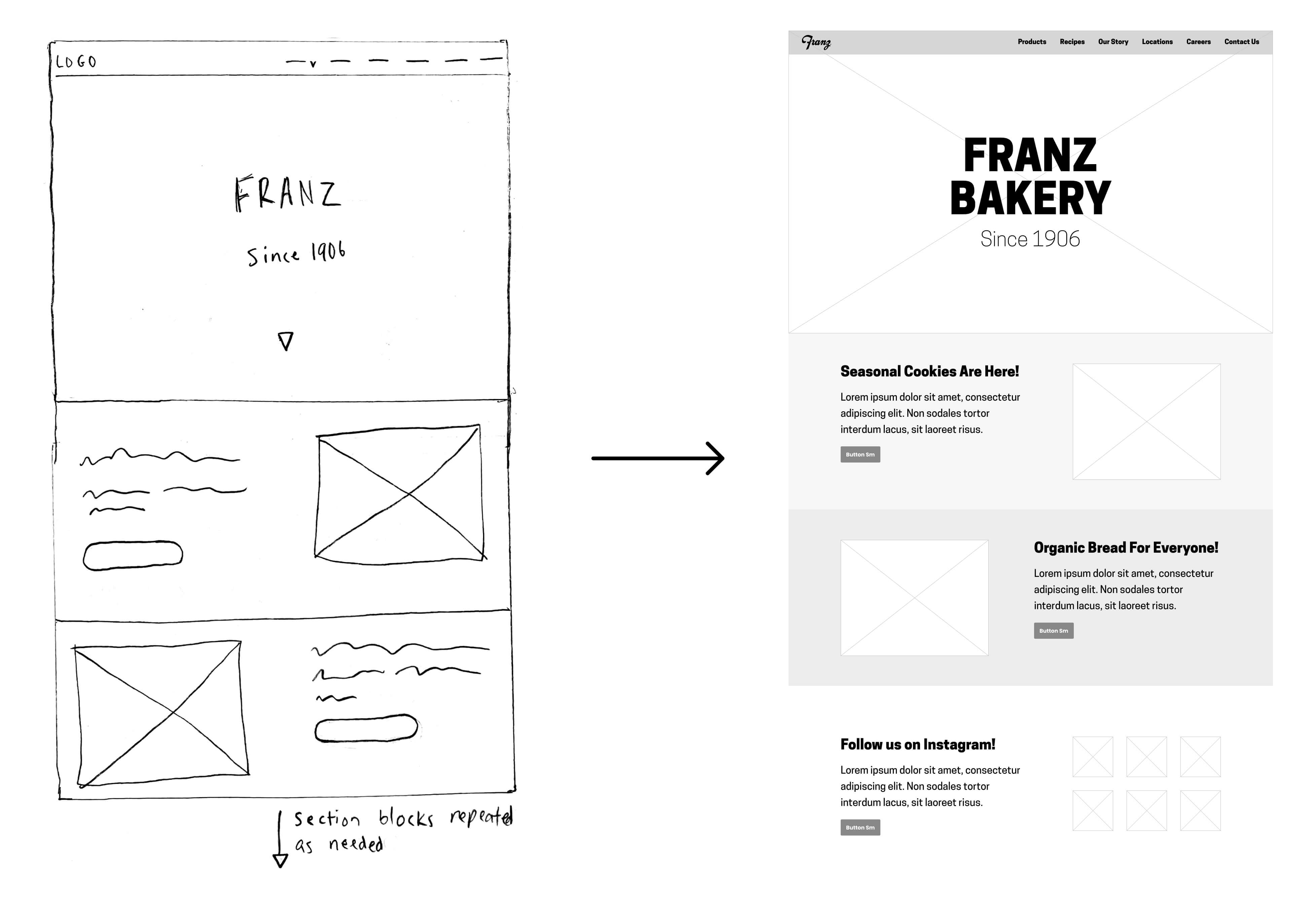
I first laid out the home page and a typical product page.
The goal of the homepage was to introduce the site's main functionality (top menu), make a good first impression (hero images), and then have standardized content blocks below the fold. Theses blocks could be added or subtracted as needed to promote new products, contests, and so forth.
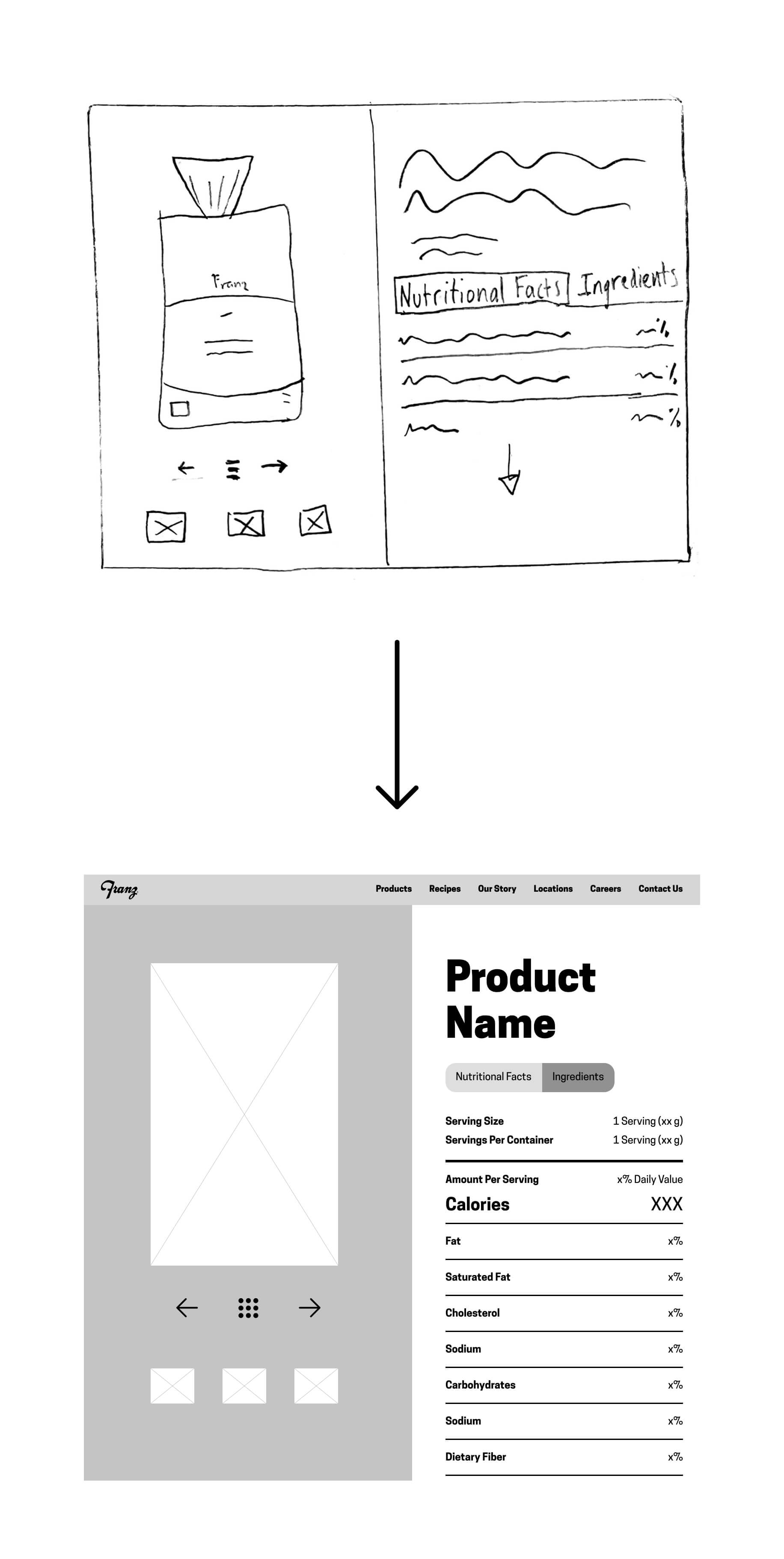
Every product page would have the same layout, with a photo of the product and any significant nutritional callouts on the left, and nutritional information and ingredients on the right. The goal was simplicity and clarity.
I also knew from my product categorization exercise that no one category contained more than a dozen or so items. Thus there was no need to complicate matters with any kind of ‘sort by’ feature.
Code
Stakeholders were happy with the direction I was going in, and I had to move right along to stay on schedule. I built out the site's skeleton in HTML based off my Figma wireframes, then began styling everyting.
 HTML Framework
 Utilizing jQuery
 Design System with SASS
HTML Framework
Each key page would need to be designed individually - this included the homepage, locations, story, and so forth. The product categories pages would just need to be designed once, as would the individual product pages and individual recipe pages.
Finally, all of the more niche pages linked from the footer (donation requests, Franz Foundation, etc) would all follow the same simple template.
jQuery .load() Function
In many instances I figured things out as I went along. I had little frame of references when it came to best practices. I'm still not sure whether compartmentalizing blocks of HTML is a popular technique, but it worked wonders for me.
I made individual pages for components like the navbar and the footer, then used the .load() function to drop them into each page. This meant that whenever I needed to make a change to a component, I just had to change it once, rather than once per page!
Design system powered by SASS
I realized quickly that just using plain CSS would get messy. I wanted to create variables, extendable snippets, and nested styles. SASS to the rescue.
I used SASS to define my styles – fonts and colors, plus common components like buttons and links. I also created shortcuts for bits of code that I used a lot, like defining breakpoints and media queries. I was all about writing as little code as possible, and SASS helped!
Dynamic Product Page
I made a spreadsheet containing the ingredients and nutritional information for every product listed. Each column was titled with an ID that corresponded with an ID on the product page.
I converted the spreadsheet to JSON, and used that to dynamically populate the product page depending on which product was clicked on.
Mobile Responsiveness
Predefining many responsive styles in SASS at the start was helpful. Grid items then just fell into place, collapsing as necessary depending on the width of the browser/device.
Some pages like Our StoryOpens in a new tab became very scroll-heavy on mobile. I didn't do much about that. I had a hunch that it was not going to be a highly visited page, and wanted to be proven wrong in the analytics before I spent time on it.
Design
Building out the site was a surprisingly smooth process, considering how much I was figuring out on the fly. Defining styles early on kept things looking uniform, and slowly but surely the site took shape.
The site launched on April 1, 2019 – the comapny's 113th birthday! Feel free to visit it and browse to your heart's content, or keep reading for some explanations of specific features.
Product Menu
I followed the sitemap and divided the products into eight categories. Customers widely praised our products' visual appeal, so I included featured product images A nice even number also helped for responsiveness, as the menu turns into a 4x2 grid starting at tablet widths.
The category page includes a small menu that divides products into subcategories. Sweets are broken down into 'Donuts', 'Cookies', and 'Pies', for example.
Product Switching
Clicking left or right navigates between products in a given category. Clicking the center menu button returns to the category page.
The code that enabled this was a huge challenge for me! If I were just designing the UX, I'd add more functionality, (for example, a section that lists similar products), but I did what I could given my abilities and time.I think it is a rather pleasant experience!
Home Page
Above the fold, the homepage contains a stakeholder requirement (a carousel of hero images that were specifically requested), and a main menu containing the most links for core users.
Below the fold I set up content blocks that can be customized to meet the needs of the comapny.
By defauly, the blocks expand on the most popular pages (products, recipes, etc), but I can easily add and remove blocks for specific seasonal products, contests and promotions, and so forth.
Validation
Soft Launch
The site was soft launched in March of 2019, where employees were encouraged to browse, and to share the new site with friends and family. I received some valuable feedback, but nothing required major overhaul. On April 1 (the company’s birthday!) the new and improved franzbakery.com was officially launched.
 Opens in a new tab
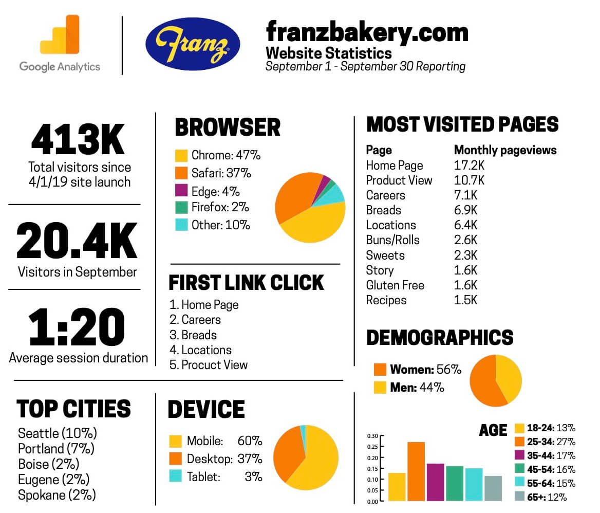
Google Analytics
Opens in a new tab
Google Analytics
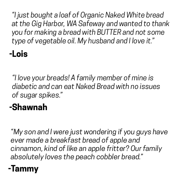 Customer feedback
Google Analytics
I don't pretend to be particularly savvy when it comes to the world of digital marketing, but I did teach myself enough Google Analytics basics to set up basic tracking.
This allowed me to demonstrate which pages were getting viewed the most, where visitors were coming from and on what kind of devices they were using.
Every month, I'd compile a report containing basic data to share with stakeholders, helping them understand user behavior and inform business decisions.
Customer Feedback
I integrated FormspreeOpens in a new tab to handle all form submissions. It has worked beautifully, storing all submissions, automatically forwarding them to the appropriate department, and allowing me to eaisly export them into a spreadsheet.
The main contact form has also been a reliable soure of customer feedback!
Lessons Learned
Preface: I wasn't a full-time developer before this project, and I'm not one now. That said, I gained valuable experience designing for developers. I used to marvel at all of the beautiful UI shots on Dribbble, thinking that I was catching a glimpse of the future of the Internet. I still marvel at them, but tend to see them more as proofs of concept, most of which would be a developer’s nightmare.
I also learned to speak the language of the stakeholder – in this case, company executives with no knowledge (or particular interest) in UX, coding, or design writ large.
I went into this project with a grand vision of carrying out heaps of research, meticulously wireframing, and conducting test after test. However, I was ultimately delivering a product to people who saw this project as a linear endeavor (Step 1: code the homepage. Step 2: code the Organic Whole Wheat Bread Page. Step 3: code the Organic Sourdough Bread page. Step 4….)
My process landed somewhere in the middle. I wasn’t able to conduct as much research as I wanted, and my design process was rather linear. But I advocated and received the time and resources for some really valuable steps along the way, for things like customer/employee interviews and card sorting exercises.