Why This Project?
It was July of 2021 and my 30th birthday was fast approaching. I wanted to invite all my friends to a potluck at the park – easy enough right?
My first thought was Facebook Events, the tried and true go-to for over a decade. Except I, nor virtually any of my friends, used Facebook anymore.
Next I tried creating a calendar event and sending it to everyone. Only problem there was that I didn’t have all of my friends’ email addresses, and you can’t easily send calendar invites via text.
Growing increasingly grumpy, I wrote out a long text message to send via a giant group chat. Then I thought of all the times I’d received an invitation via text and forgot all about it after it got buried under new messages.
In the end, I created a Facebook event, where I could use its robust feature set to write out a description, provide an itinerary, add a cover photo, and so forth. Then I texted a link to the event to everyone.
I was determined to come up with a better way to do this.
Research
The Competition
- Facebook is what most people think of first for events. It can do everything and most people know how to use it. However, it suffers from a declining user base in the USA.
- GroupMe is a iMessage/SMS alternative, similar to WhatsApp. It was the best alternative I found, yet it still requires everyone to download and register.
- PaperlessPost and Punchbowl allow users to create and send elaborate e-vites thanks to their extensive template library. They're completely over the top for the average person’s day-to-day needs.
Surveys
I wanted as much feedback as possible, and I didn’t have time to conduct both interviews and surveys, so I opted for the latter. The decision paid off. I got about twenty responses, and the information they provided was enormously validating. Virtually everyone said they hate Facebook and only use it when texting is insufficient. More than half mentioned wishing there were a way to add more detail to a text invitation.
Definition
Utilizing research findings
The survey responses made it clear that it was at least worth exploring what an event feature built into the Messages app would consist of. Every respondant with an iPhone reported using Messages to plan and attend events, and several complained that it was lacking sufficient functionality.
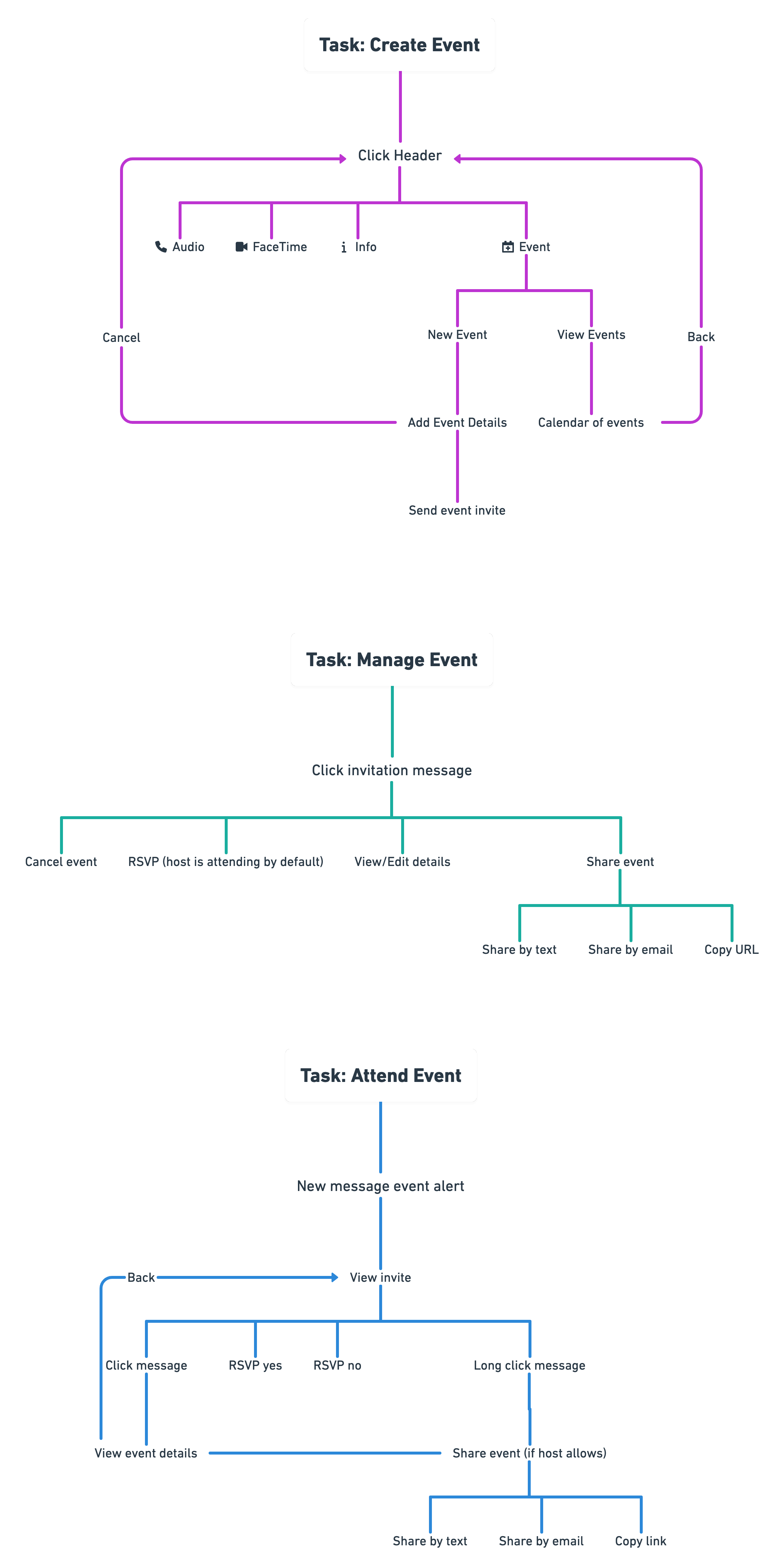
Mind Map
I started by drawing a rough mind map. It helped me begin to visualize the feature’s information architecture and identify potential pain points. I realized that there were three basic task flows: creating an event, managing an event, and attending an event.
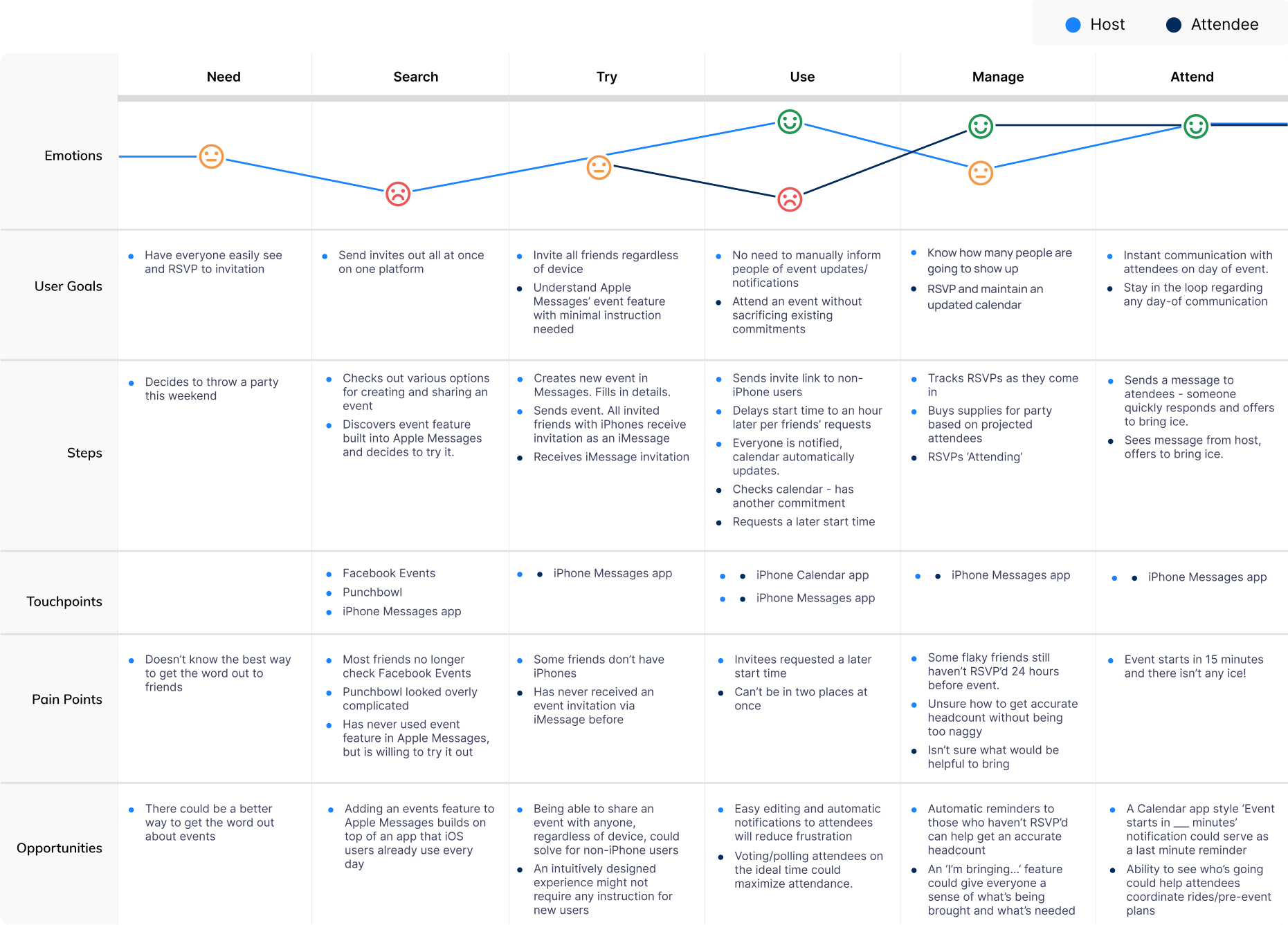
User Journey Map
I needed to get in the mindset of the user. I created a journey map with two paths: one for a host (creating and managing an event) and one for an attendee (attending an event). It helped me empathize with the user and better identify steps that could cause confusion or areas that could be improved (or removed entirely!)
Ideation
Wireframes
Apple's design guidelines leave little to the imagination, so it wasn't particularly helpful to spend much time on wireframes. I did some quick sketches but was eager to create a prototype that I could test.
All Wireframes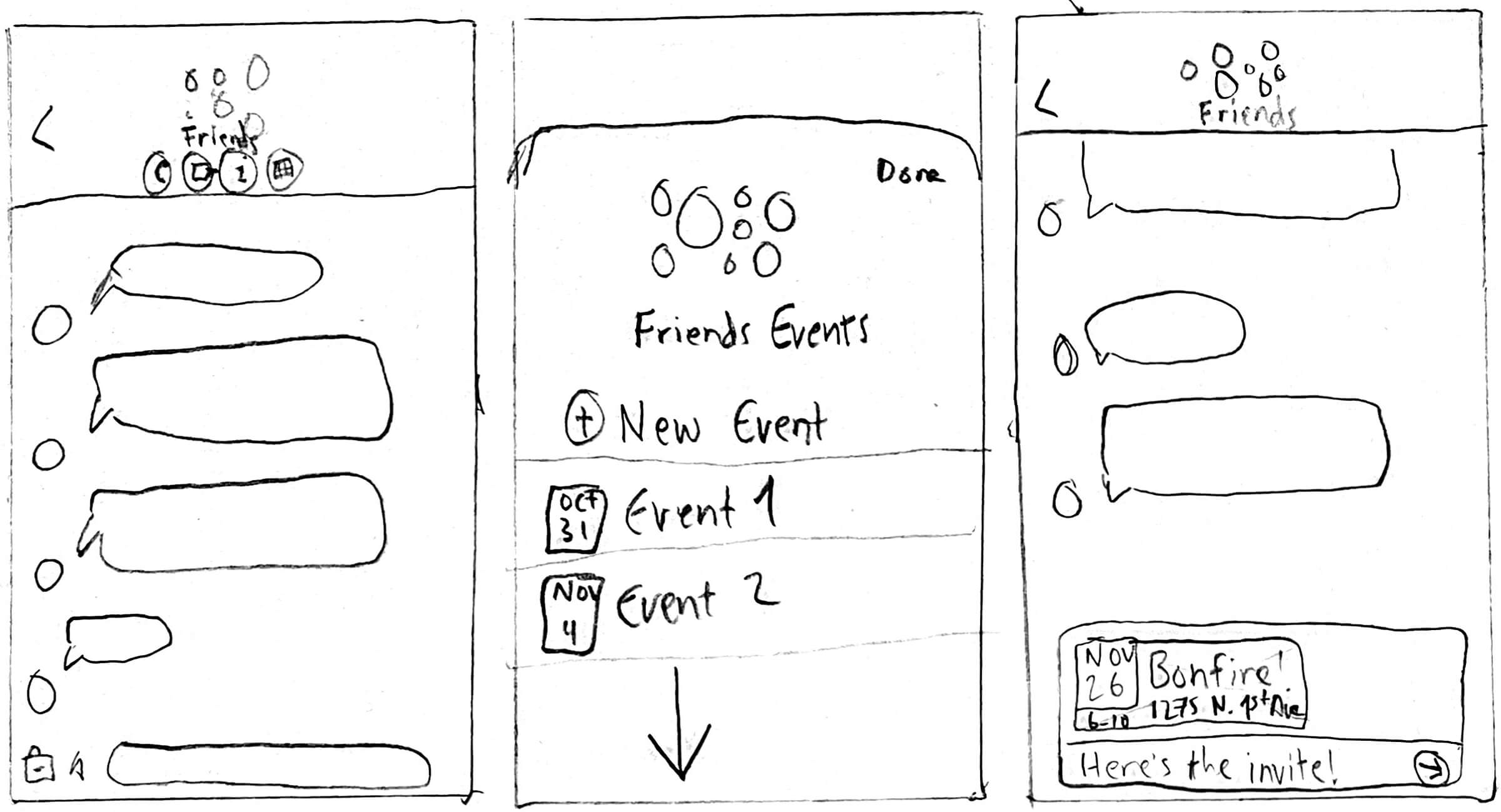

Design

UI Kit (created by Apple)
Apple’s UI guidelines are famously comprehensive, and I was constantly checking to be sure every single design decision I made fell in line with Apple’s standards. I took extra care in making everything look like it belonged in the Messages app, and when necessary, the Calendar app.
Because Apple has such well defined styles, there were no UI assets for me to design. I used the existing Messages and Calendar apps as guides, and relied on Apple's public-facing resources like their Messages Design Template and SF Symbols.
Interactive Components
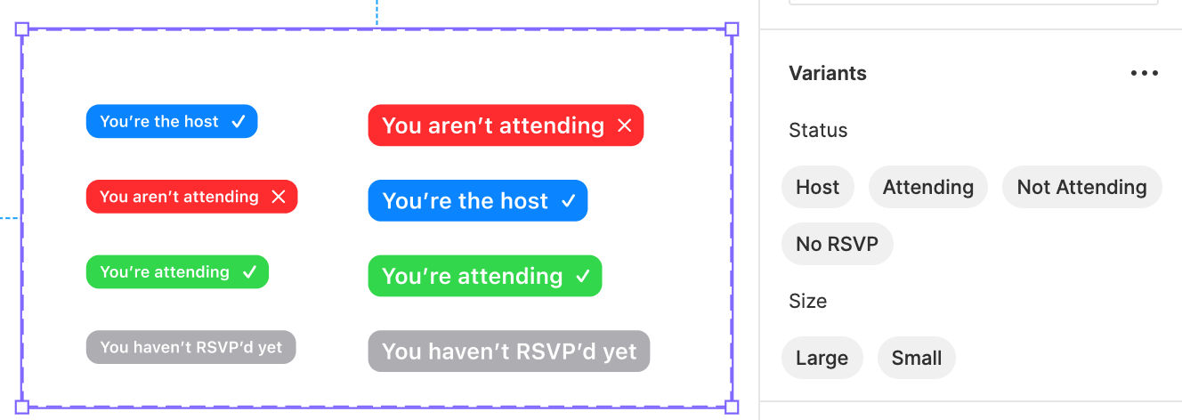
Figma's new interactive components feature saved me time and allowed for some cool prototyping opportunities. I used this for components like RSVP tags and toggle sliders.
Prototype
I built this prototype in Figma, where it runs through the aforementioned tasks – creating, managing, and attending an event. You can try it out for yourself here. Note that viewing Figma prototypes on a phone is a little bit funky. I'd recommend using a computer or tablet.
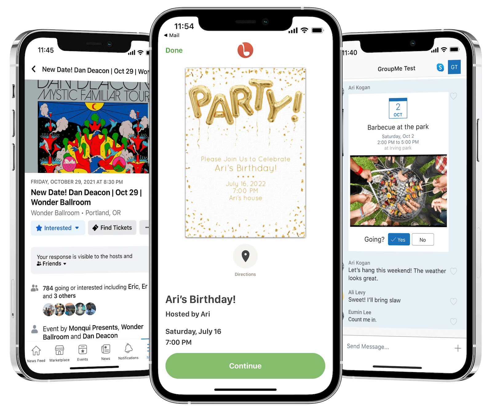
Creating An Event
The only logical place to put an 'events' button was in the dropdown menu alongside 'phone', 'FaceTime', and 'info'. I was a bit apprehensive about it being hard for users to find, and made a note to see how users would fare during testing.
The initial screen after clicking 'events' displays a chronological list of upcoming events, alongside the user's current RSVP status. At the top is a link to create a new event. Clicking this opens a form that mimics the 'New Event' screen in the Calendar app.
Creating the event preloads an iMessage with the event information which then just needs to be sent.
Managing An Event
Once an event is sent out, the host can go back in to edit details and track RSVPs.
The event is automatically added to attendees default calendar, allowing day-of reminders or time change notifications.
Attending An Event
To make RSVPing as effortless as possible, I added a button right in the invitation to change their status. This updates the attendance and also adds the event to the respondant's calendar automatically.
Invitees can also click into the event to see more details.
Validation
Usability Tests
I combined the three functions (hosting, managing, and attending) into one prototype and had users run through it and provide detailed feedback.
Every user was excited by the feature's potential and expressed a desire for Apple to implement it.
The most common critique was that the events button was difficult to find inside the hidden messages toolbar. While I knew this would be a potential pain point, I still believe it's the best place for the button to live. Accessing events is not the primary purpose of the Messages app, and it would take up valuable real estate anywhere else. The toolbar on the other hand has plenty of space for this new icon, and it shouldn't cause confusion once users are made aware of its location.
Final Takeaways
- Apple should take note. 100% of testers expressed wanting this feature added. Several said that they'd fully delete Facebook if it existed.
- Embrace laziness! People tend to be lazy and forgetful. That's why making plans via text can be so hard - the text gets forgotten about and the plans fall through. Adding one click RSVPs to Messages provides structure to people's social planning without any extra effort.