Supply
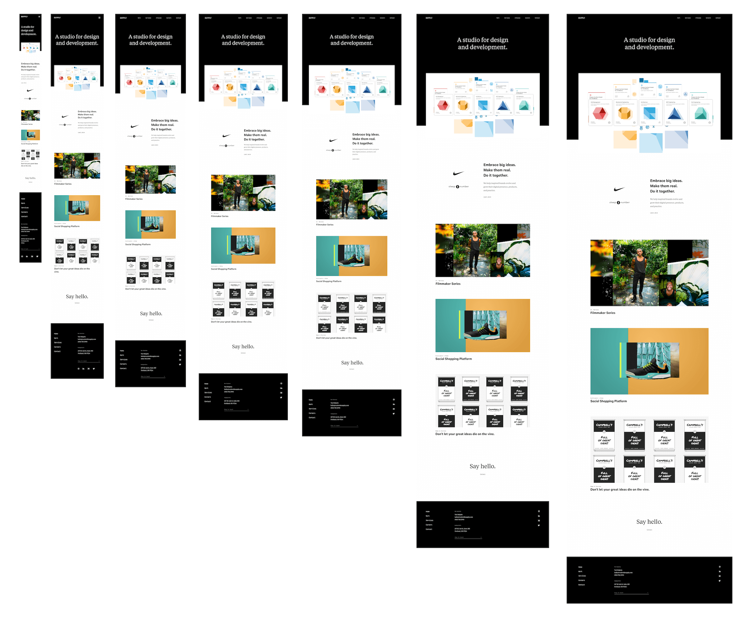
How might an agency best showcase its capabilities, stand out, and attract clients?
ROLE
Senior UX Designer
UX Design, Content Strategy, Motion Design, Prototyping & Testing, vQA
DATE
2023
Service Offerings
I led both design and content strategy for the service offerings pages. My directive was to highlight Supply’s four key areas of expertise. This created a natural opportunity to encourage visitors to get in touch and inquire about our services – thus, I employed some product marketing tactics such as repeated prominent CTAs.
The cherry on top of these pages was a series of animations that visually demonstrated each service offering. I don’t get to do a whole lot of motion design in After Effects these days. It was a ton of fun!
Articles
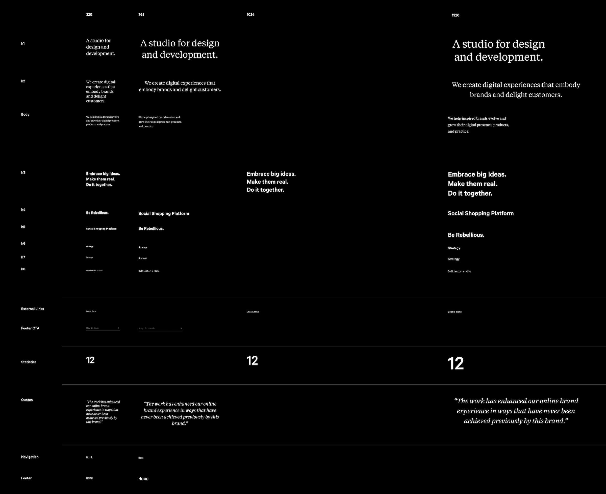
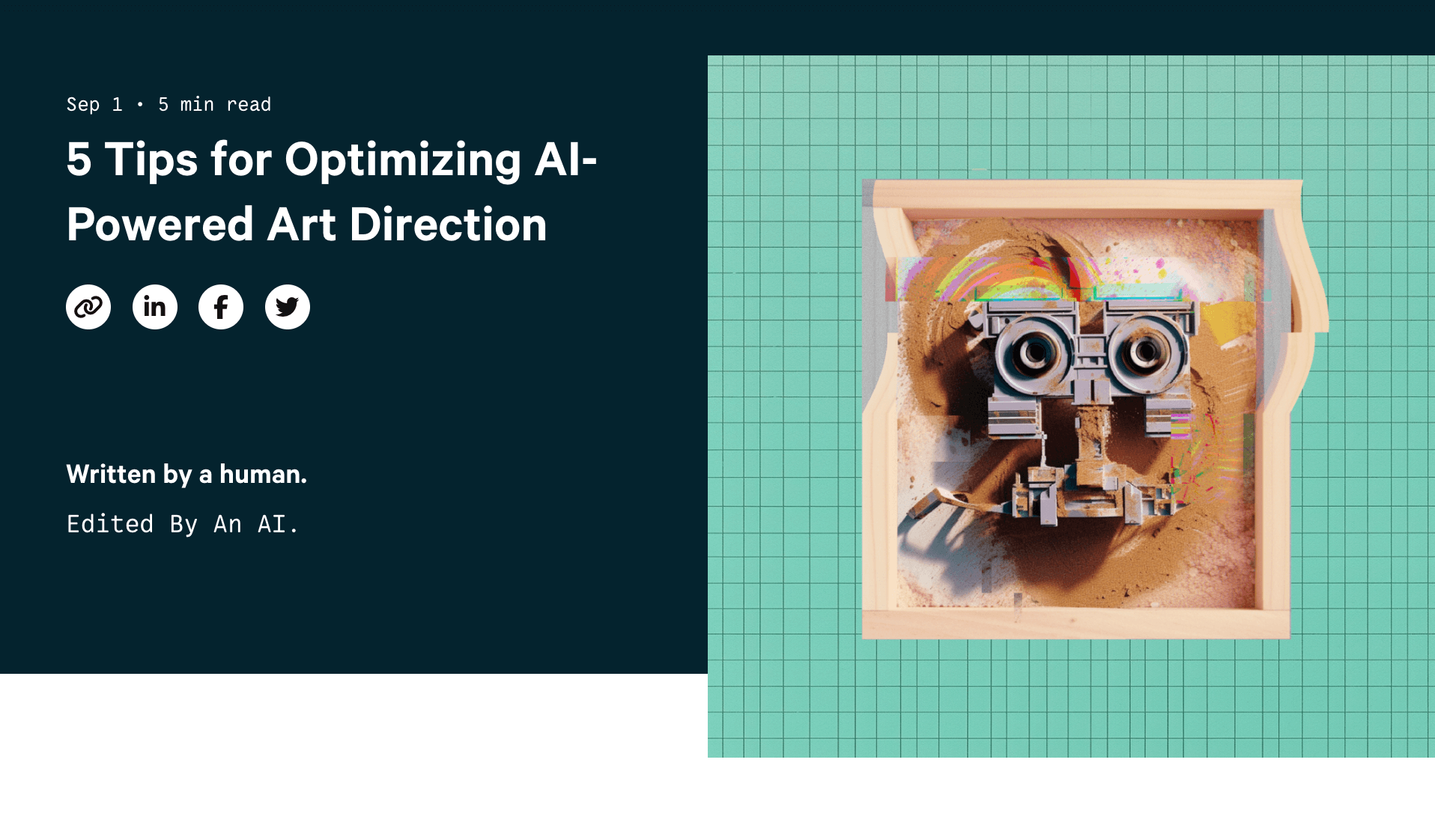
Supply’s site was designed with intentional rigidity and simplicity, allowing our client work to shine. The articles section was our chance to break a few rules and have some fun.
The stories themselves were written by a number of different Supply employees, and the leading graphics were created in Midjourney.
Takeaways
Working on the website for my own company was a fun and rewarding change of pace. I enjoyed the challenge of balancing the two central goals: showing off work and getting potential clients to reach out. It required a lot more discussion and iteration around the site's content strategy than I would have anticipated, but the end result was well worth it.


